Redesigning the front door of Australia's most-used banking app, from 2.78% to 11% acceptance rate.
CommBank App 5.0 flagship release
June 2023
Shasha Chaicharncheep Experience Design
Ben Pride UI Design
My role
Specialist experience designer
I was the specialist experience designer working within a cross functional team with a UI designer, PO, developers, testers and the larger app 5.0 program team. My role included UX & UI, product strategy, research and facilitating workshops.
Context
The first step toward a super app.
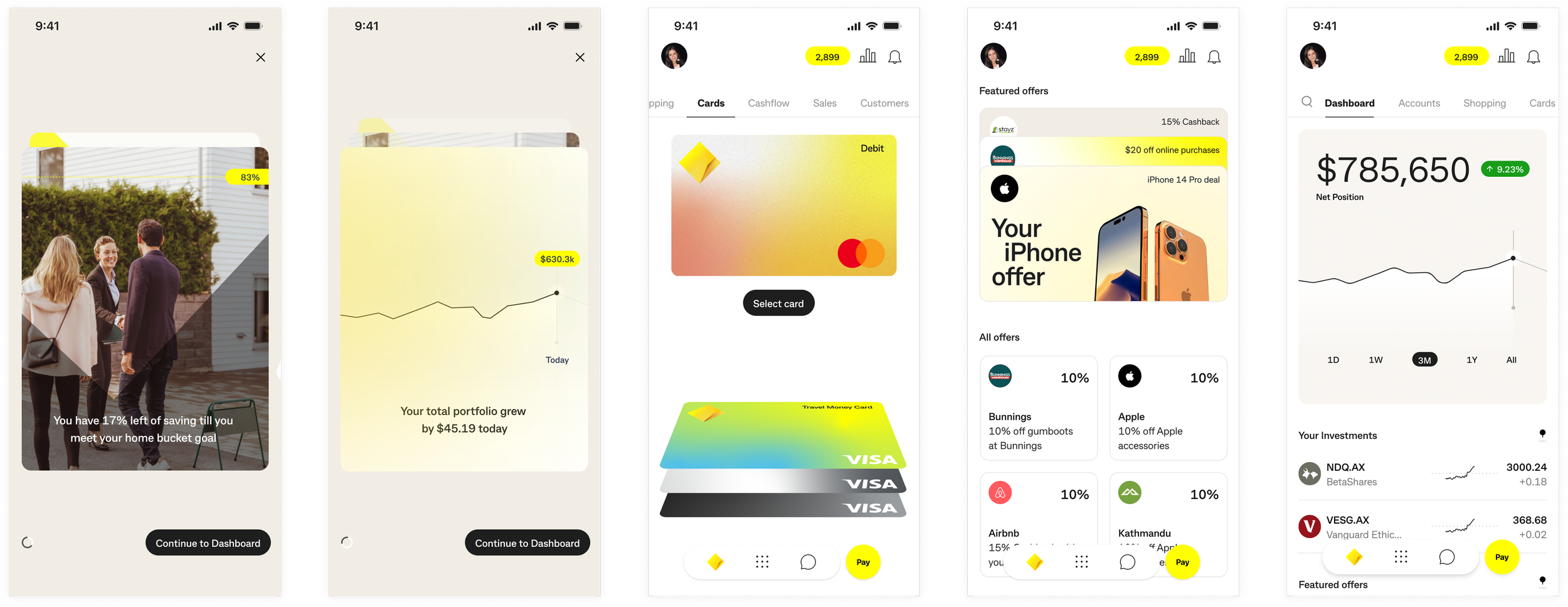
CommBank's App 5.0 strategy, developed with Accenture Song, aimed to turn the CommBank App from a banking utility into a super app. The dashboard was the first move, the screen every customer landed on, and the space CommBank wanted to use to introduce them to everything else it offered. I joined the cross-functional team building it, picking up where two of our designers had already refined Accenture's initial concepts.
Problem
Real estate customers barely used, now asked to do more.
Research showed customers rarely explored beyond the dashboard and accounts screen. They came to do core banking tasks and left. A quantitative survey of 1,000 customers told us the engagement tile, the component built to carry this new content, was the least valuable thing on the dashboard. We were building the centrepiece of a super-app strategy on real estate customers didn't want filled with “marketing”.
Process
Two tracks to iterate fast and align
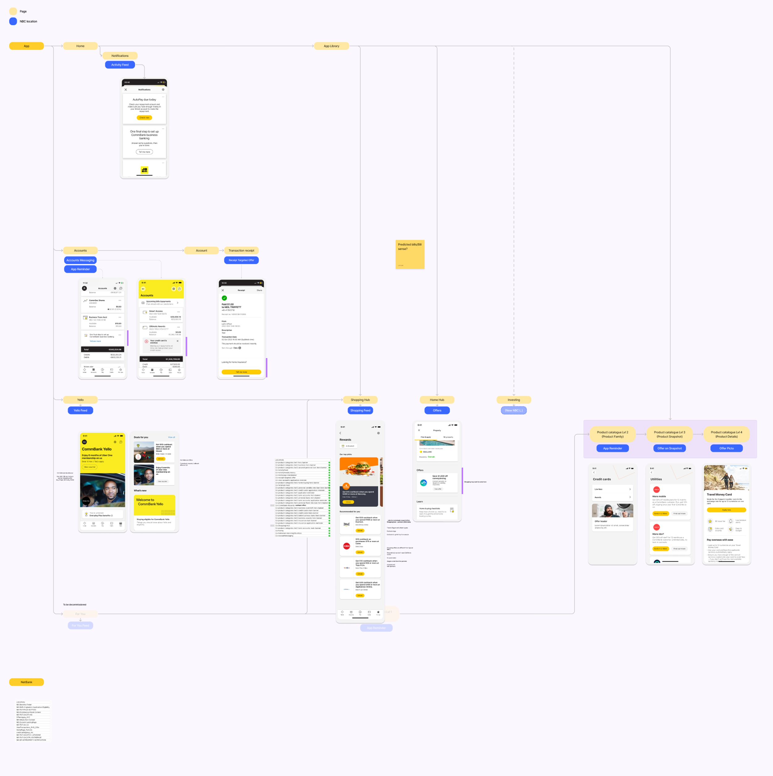
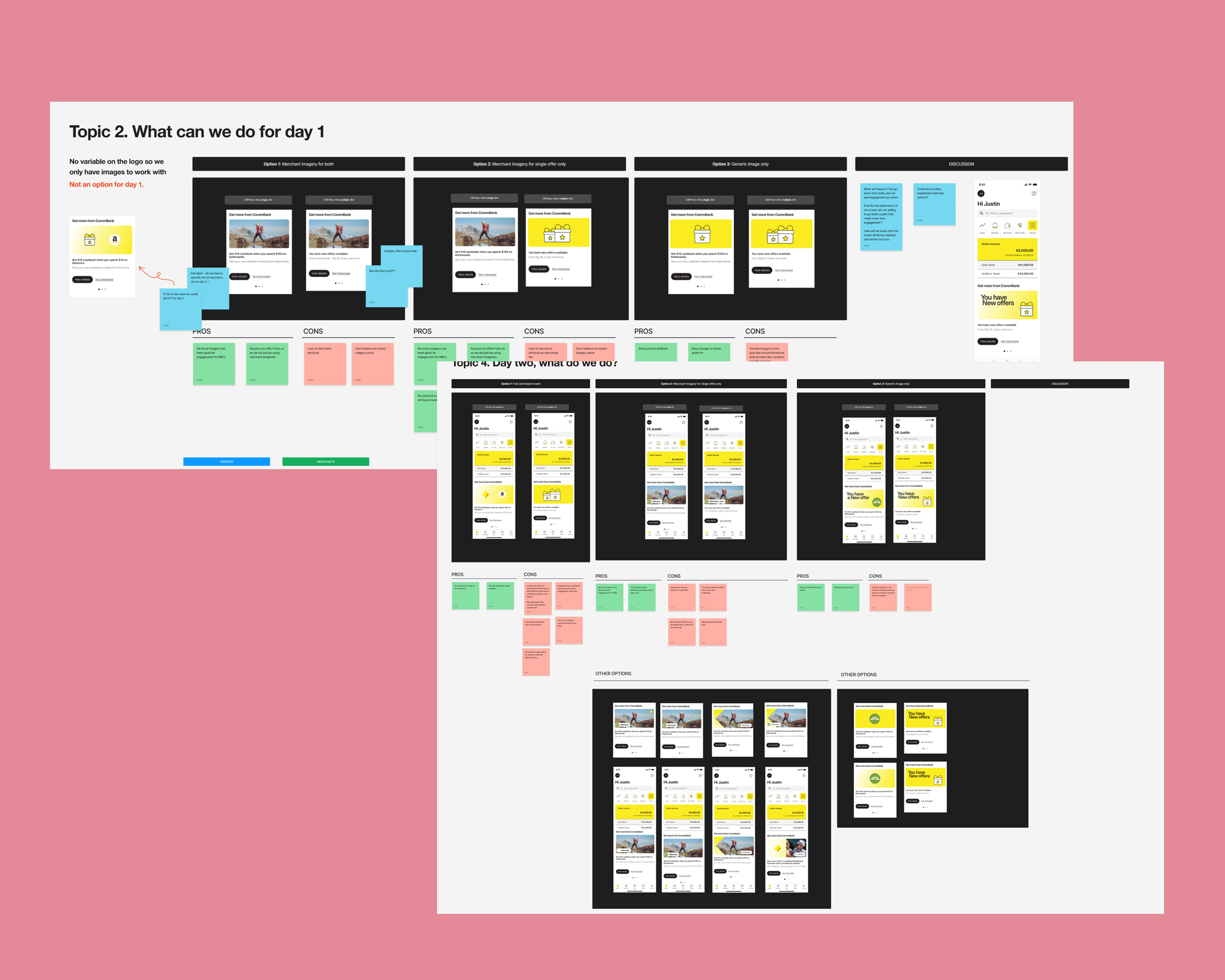
The work split into a stakeholder track; mapping existing messaging, running workshops with optimisation managers, brand, marketing, data and product to define requirements, the recommendations engine and business metrics, and a design track, where I ran explores, concept testing, two rounds of usability testing, an implicit association test and image template work before handing over to engineering.
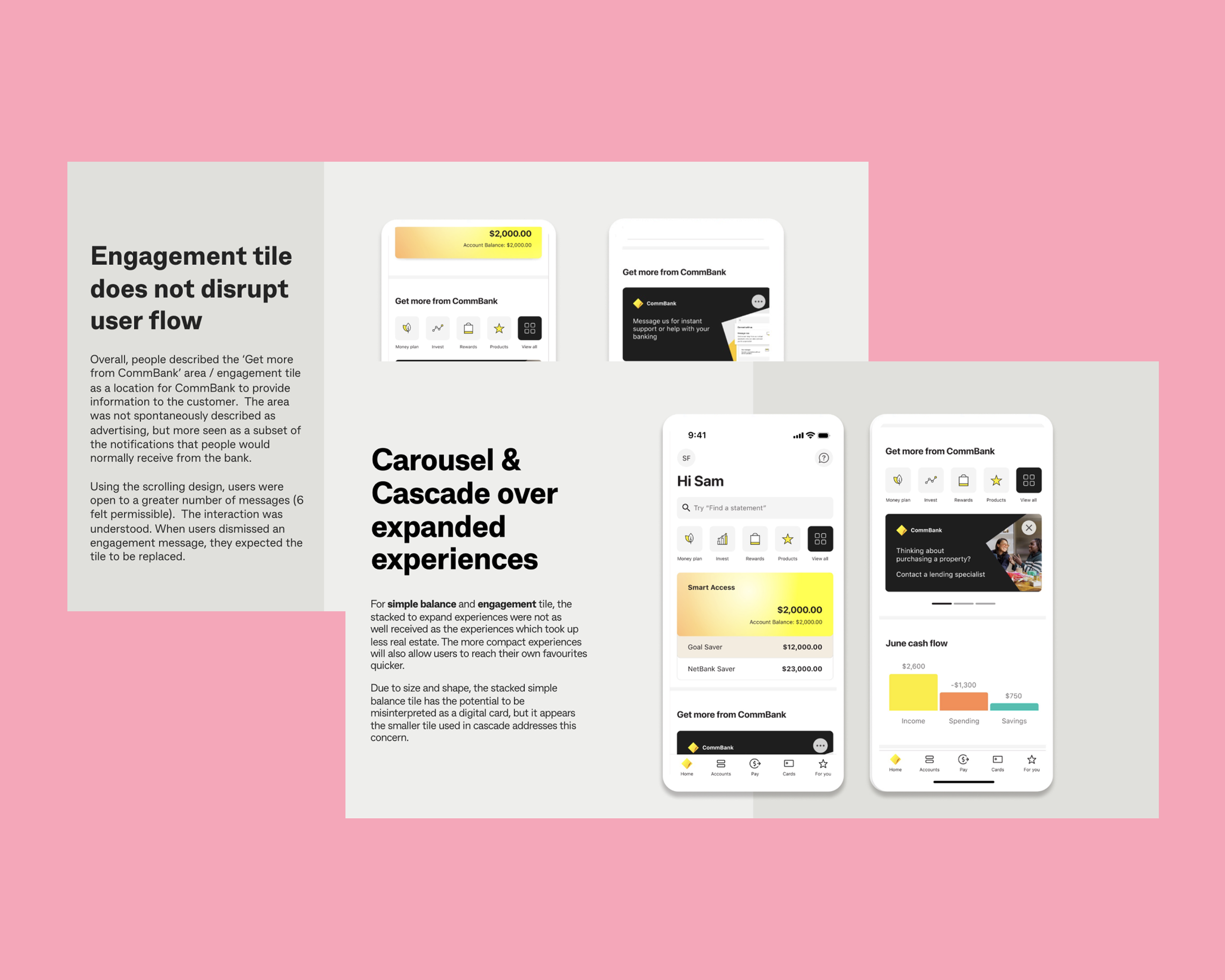
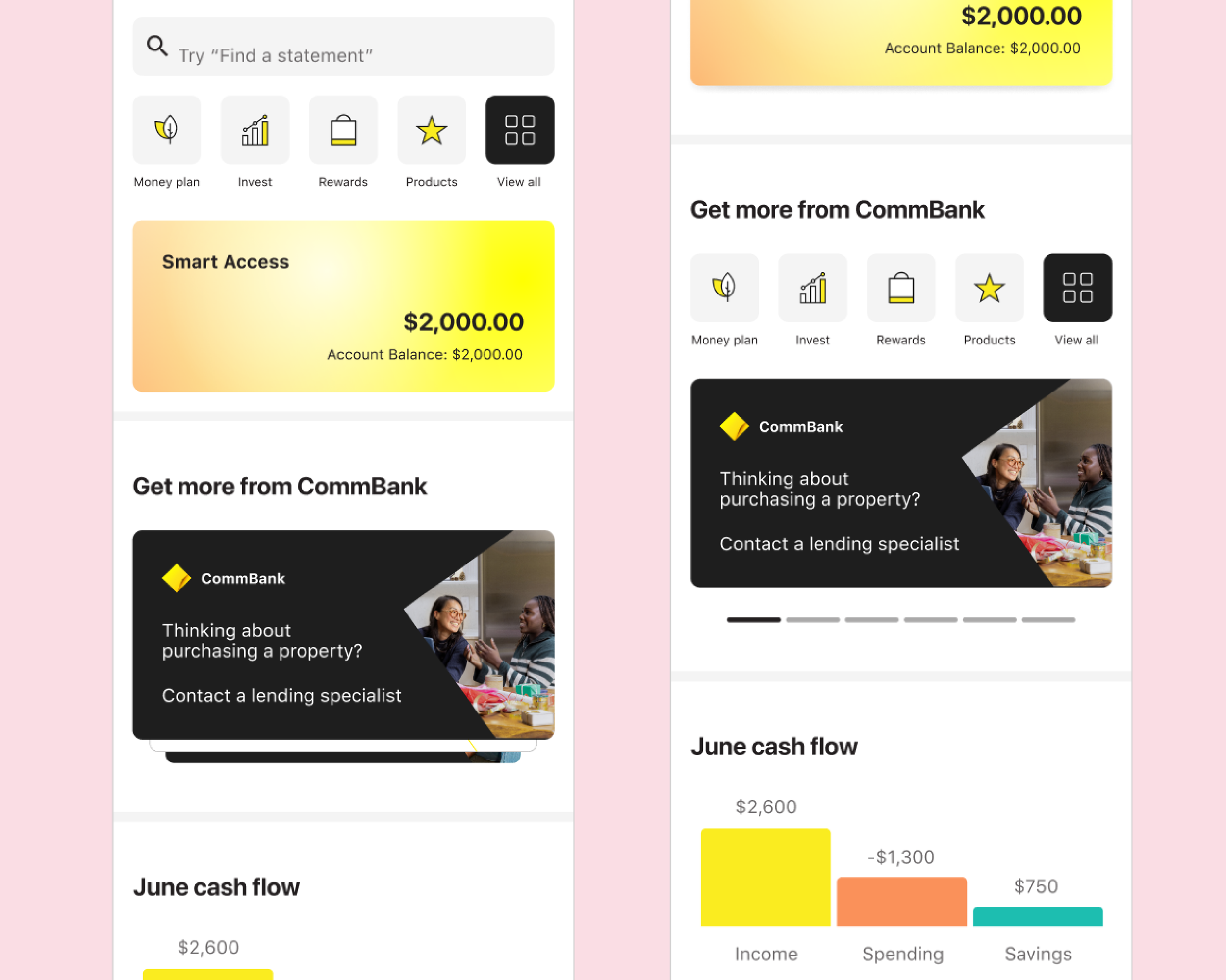
Concept testing favoured a carousel over a cascade experience, and customers read the tile as a notification, not advertising. The quantitative survey confirmed it still tested as the dashboard's least valuable element, sending me back to rework its requirements.
The biggest disagreement was over the underlying logic: marketing stakeholders wanted ten tiles, a default tile, session-level rotation, a 30-day cooldown and impressions as the headline metric. Through research and workshops I talked them down to three tiles, no default, daily rotation, a 180-day cooldown, and engagement over impressions.
Solution
A layout that surfaces more without getting in the way of core banking.
What shipped split the dashboard into two feeds: an Activity Feed for critical, time-sensitive notifications (compliance, security, fraud, payments, product changes), and the engagement tile for personalised content (acquisition, offers, Yello, partner content, education). It launched with App 5.0 in June 2023, stress-tested with real next-best-action content beforehand.
We resolved lingering tension over partner brand representation by tiering partnership content, each tier with its own image template, to properly showcase CBA's partnerships without diluting them. We turned the tile's structure, rules and templates into guidelines and trained OMs, marketing and brand to use them.
Impact
Acceptance rate from 2.78% to almost 11%
The old "For You" tile reached 731,000 customers in January 2023, with 20,000 unique clicks and a 2.78% acceptance rate. By January 2024, the redesigned tile reached 2.7 million customers, generated 299,000 unique clicks, and lifted acceptance to 10.96%.